Data visualization is an essential tool for anyone who wants to make sense of complex data. By creating clear and concise charts, we can communicate insights and trends that might not be immediately obvious from raw data alone.
However, with so many chart types available, it can be challenging to know which chart to use for different types of data.
One critical consideration when selecting a chart is the distribution of the data. Different data distributions require different chart types to effectively visualize and communicate the data. Choosing the wrong chart can lead to misunderstandings or even misinterpretations of the data.
In this article, we will provide guidance on how to choose the right chart for your data distribution. We will start by discussing different types of data distribution and how to identify them. Then, we will introduce several chart types that are commonly used to display data distribution and discuss when to use each one.
Finally, we will provide some tips for creating effective and informative charts. By the end of this article, readers will have a better understanding of how to select the right chart for their data distribution and create compelling visualizations that communicate their insights effectively.
Understanding Your Data Distribution
Data distribution refers to the way in which data values are distributed or spread out across a range of values. Different types of data distribution have different shapes, which can affect the choice of chart used to display the data.
Before selecting a chart type, it is important to understand the type of data distribution present in your data.
There are several types of data distribution, including:
Normal Distribution: In a normal distribution, data values are distributed symmetrically around a central point, forming a bell-shaped curve.
Skewed Distribution: A skewed distribution occurs when the data values are not evenly distributed and are biased towards one end of the scale. Skewed distributions can be either positively skewed or negatively skewed.
Bimodal Distribution: A bimodal distribution occurs when the data has two distinct peaks, indicating that there are two distinct groups or populations within the data.
Uniform Distribution: A uniform distribution occurs when data values are evenly distributed across the entire range of possible values.
Understanding the type of data distribution present in your data is critical to choosing the right chart type to display your data accurately and effectively. In the next section, we will explore different chart types commonly used to display data distribution.
Types of Charts for Data Distribution
There are several types of charts that are commonly used to display data distribution. Here are some of the most popular ones:
1. Histograms
Histograms are a type of bar chart that display the frequency or count of data values within specific intervals or bins. Histograms are useful for showing the distribution of continuous numerical data.

To create a histogram, the range of data values is divided into intervals or bins, and the number of data values that fall within each bin is counted.
The resulting frequency or count is displayed as the height of a bar above each bin, with the bars touching to create a continuous distribution.
Histograms are useful for showing the shape of the data distribution, including the location and spread of the data, as well as any modes or gaps. They are also useful for identifying potential outliers in the data.
One potential limitation of histograms is that the choice of bin size can affect the interpretation of the distribution. If the bins are too large, important details of the distribution may be lost, while if the bins are too small, the data may appear more variable than it actually is.
Therefore, it is important to choose an appropriate bin size that accurately reflects the distribution of the data.
Overall, histograms are a popular and effective way to display the distribution of continuous numerical data.
2. Box Plot
Box plots, also known as box-and-whisker plots, display the distribution of data by showing the median, quartiles, and outliers of a dataset.

To create a box plot, the range of data values is divided into quartiles, with the median (50th percentile) marked by a line within a box. The box represents the interquartile range (IQR), which is the range between the 25th and 75th percentiles. The whiskers extend from the box to show the range of the data, excluding any outliers. Outliers are shown as individual points outside of the whiskers.
Box plots are useful for showing the spread of data and identifying potential outliers. They are particularly useful when comparing distributions between different groups or datasets, as the box plot allows for easy comparison of the medians and ranges.
One potential limitation of box plots is that they do not show the shape of the distribution as clearly as some other chart types, such as histograms or density plots. Therefore, box plots are best used when the primary focus is on comparing the spread and central tendency of different datasets or groups.
Overall, box plots are a popular and effective way to display the distribution of numerical data and compare distributions between different groups or datasets.
3. Density Plots
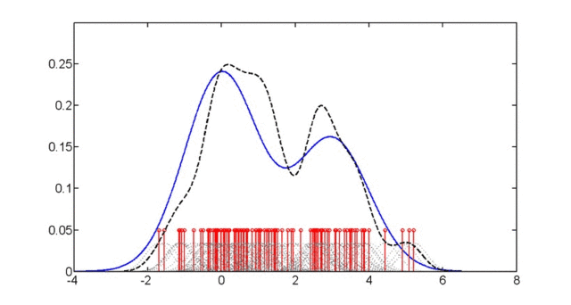
Density plots display the distribution of data by showing the probability density function of the data.
To create a density plot, the range of data values is divided into small intervals or bins, and the density of data points within each bin is calculated. The resulting density function is then displayed as a smooth curve that shows the shape of the distribution.

Density plots are useful for showing the shape of the distribution and identifying potential modes. They can be particularly useful when comparing the distribution of data between different groups or datasets, as the density plot allows for easy visual comparison of the shape of the distribution.
One potential limitation of density plots is that they can be more difficult to interpret than some other chart types, such as histograms or box plots. In addition, the smoothness of the curve can be affected by the choice of smoothing algorithm, which can impact the interpretation of the data.
Overall, density plots are a popular and effective way to display the distribution of data, particularly for continuous numerical data. They are best used when the primary focus is on showing the shape of the distribution and comparing the distribution between different groups or datasets.
4. Scatter Plots
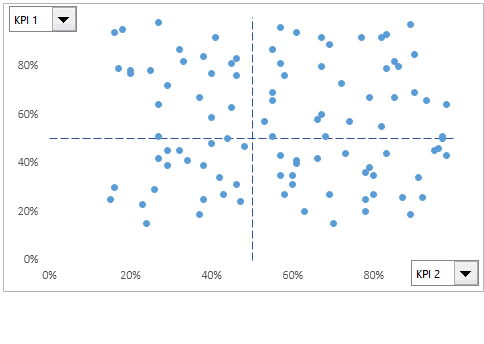
Scatter plots display the relationship between two variables. Each data point in a scatter plot represents the value of one variable on the x-axis and the value of the other variable on the y-axis.

Scatter plots are useful for showing the correlation between variables and identifying potential outliers. They can be particularly useful when exploring relationships between variables or looking for patterns in the data.
Scatter plots can also be enhanced by adding additional information such as colour or size to the data points, which can be used to display additional variables or highlight specific patterns in the data.
One potential limitation of scatter plots is that they may not show the full extent of the data if the data has a high degree of overlap or if there are many data points. In addition, scatter plots may not be suitable for displaying more than two variables, as the additional variables can be difficult to display in a clear and understandable way.
Overall, scatter plots are a popular and effective way to display the relationship between two variables and identify patterns in the data. They are best used when exploring relationships between variables or looking for patterns in the data.
5. Violin Plots
Violin plots display the distribution of data by combining aspects of box plots and density plots.
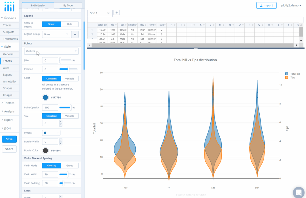
To create a violin plot, a density curve is created for each group or dataset being compared, and the curves are mirrored and connected to form a symmetrical shape resembling a violin.

The width of the violin at each point represents the density of data at that point, with wider sections indicating higher density. Inside the violin, a box plot can be added to display additional information about the data, such as the median and quartiles.
Violin plots are useful for showing the shape of the distribution and identifying potential outliers. They can be particularly useful when comparing the distribution of data between different groups or datasets, as the violin plot allows for easy visual comparison of the shape of the distribution.
One potential limitation of violin plots is that they can be more difficult to interpret than some other chart types, such as box plots or density plots. In addition, the use of multiple violins in the same plot can make the visualization more complex and harder to understand.
Overall, violin plots are a popular and effective way to display the distribution of data, particularly for comparing distributions between different groups or datasets. They are best used when the primary focus is on showing the shape of the distribution and comparing the distribution between different groups or datasets.
6. Heat Maps
Heat maps display data in a two-dimensional grid, with each cell representing a combination of two variables. The cells are filled with colour to indicate the value of the data at that combination of variables.

Heat maps are useful for displaying the patterns and trends in large datasets, particularly when the data is categorical or discrete.
They can be used to identify clusters or outliers in the data and to explore relationships between variables.
Heat maps can also be enhanced by adding additional information, such as labels or annotations, to the cells, which can be used to provide additional context or highlight specific patterns in the data.
One potential limitation of heat maps is that they may not be suitable for displaying continuous numerical data, as the discrete nature of the cells can obscure the underlying patterns in the data.
In addition, heat maps can be limited by the number of variables that can be displayed in a clear and understandable way.
Overall, heat maps are a popular and effective way to display patterns and trends in large datasets, particularly when the data is categorical or discrete. They are best used when exploring relationships between variables or looking for patterns in the data.
Choosing the Right Chart
Choosing the right chart for your data distribution can be a crucial step in effectively communicating your findings. Here are some key considerations to keep in mind when selecting a chart:
Data type: The type of data you have (e.g. categorical, numerical) will often determine which charts are most appropriate. For example, histograms and density plots are best suited for displaying numerical data, while bar charts and pie charts are best suited for displaying categorical data.
Distribution: Understanding the shape and spread of your data distribution can help you determine which chart will best display your data.
For example, if your data has a normal distribution, a box plot or histogram may be the most appropriate chart. If your data has multiple modes or outliers, a violin plot or scatter plot may be more appropriate.
Purpose: Consider the purpose of your chart and the message you want to convey. If you are comparing data across multiple groups, a stacked bar chart or grouped box plot may be appropriate. If you want to show the relationship between two variables, a scatter plot or heat map may be the best choice.
Audience: Consider the audience for your chart and the level of detail and complexity they can handle. For example, a simple bar chart may be more effective for a general audience, while a more complex violin plot may be more appropriate for a technical audience.
By considering these factors, you can choose the right chart for your data distribution and effectively communicate your findings to your audience.
Tips for Effective Data Visualization
In addition to choosing the right chart for your data distribution, there are several tips for creating effective data visualizations:
Keep it simple: Avoid cluttering your visualization with too much information or too many design elements. Use a minimalist approach to highlight the most important information and make it easy for your audience to understand.
Use appropriate colors: Use colors effectively to highlight important information and make your visualization visually appealing. However, be careful not to use too many colors or colors that are difficult to distinguish.
Label your axes and legends: Clearly label the axes and legends on your chart to help your audience understand the data being displayed. Be sure to include units of measurement where appropriate.
Use appropriate scales: Choose the appropriate scales for your chart to ensure that the data is displayed accurately and in a way that is easy to understand.
Tell a story: Use your visualization to tell a story and convey a message to your audience. Avoid simply displaying data without providing context or a clear message.
Test your visualization: Before presenting your visualization, test it with a sample audience to ensure that it effectively conveys your message and is easy to understand.
By following these tips, you can create effective data visualizations that help you communicate your findings and insights to your audience.
Conclusion
Choosing the right chart for your data distribution is an important step in effectively communicating your findings. By understanding the different types of charts available and considering factors such as data type, distribution, purpose, and audience, you can choose the best chart for your needs.
Additionally, following tips for effective data visualization, such as keeping it simple, using appropriate colours and scales, and telling a story, can help you create visualizations that effectively convey your message and insights to your audience. By putting these principles into practice, you can create data visualizations that are informative, engaging, and easy to understand.


